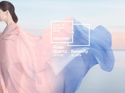
2016 Pantone Color(s) of the Year: Rose Quartz and Serenity

 For the first time EVER, Pantone – THE authority on color for the fashion and design industries has named not just one, but TWO colors as its Color of the Year. Exploring color’s softer side, Pantone has designated a blending of Rose Quartz (PANTONE 13-1520) and Serenity (PANTONE 15-3919) to reflect the public’s growing desire for balance and well-being.
“Joined together, Rose Quartz and Serenity demonstrate an inherent balance between a warmer embracing rose tone and the cooler tranquil blue, reflecting connection and wellness as well as a soothing sense of order and peace,” explained Pantone Color Institute Executive Director, Leatrice Eiseman, on the company’s website.
According to Pantone’s Color of the Year web page: “Rose Quartz is a persuasive yet gentle tone that conveys compassion and a sense of composure. Serenity is weightless and airy, like the expanse of the blue sky above us, bringing feelings of respite and relaxation even in turbulent times.”
For homeowners who swear by color psychology and the use of certain colors to lend a sense of balance to their world, this will no doubt come as good news. Atlanta-based Highlight Homes is happy to help its renovation and custom home clients incorporate these lovely new Colors of the Year in their homes. When used in conjunction with other hot trends such as crisp, white kitchens, reflective surfaces and “Old Hollywood”-inspired mirrored and metallic home accessories, both shades could lend to an elegant and sophisticated look. When used for Interiors, the Pantone press release announcing the Color of the Year suggests that “the pairing of Serenity and Rose Quartz bring a feeling of calm and relaxation into the home environment. Like a serene sunset, Rose Quartz encourages reflection on one’s surroundings while Serenity, a transcendent blue, provides a naturally connected sense of space.”
Pantone believes that both colors serve as a distinctive choice for rugs and upholstery, as well as paint and decorative accessories, such as solid and patterned fabrics, throws, pillows, bedding, kitchen items, tableware, and home accessories like candles, decorative bowls, vases and florals. Either would serve as a striking addition to any room as an accent wall or a painted door and trim.
Pantone recommends the following shades to complement Rose Quartz and Serenity: Grays such as Pantone 14-0000 Silver Gray, 18-3906 Volcanic Glass, 14-0216 Lint, 17-0613 Vetiver, 18-5204 Granite Gray, 11-4201 Cloud Dancer and 15-4702 Puritan Gray; Browns such as Pantone 19-0810 Major Brown, 18-1112 Walnut, 13-1012 Frosted Almond, 18-1108 Fallen Rock, 18-1235 Russet, 15-1218 Semolina and 16-0906 Simply Taupe; Bright pastels such as 16-2107 Orchid Haze, 15-1520 Blooming Dahlia, 16-3521 Lupine, 12-5406 Opal Blue, 18-3211 Grapeade, and 13-1125 Peach Quartz – among others.
To learn more about Rose Quartz, Serenity and Pantone’s suggested color palettes, visit the Color of the Year announcement page online.
About Pantone and the Pantone Color Institute: Pantone LLC, a wholly owned subsidiary of X-Rite, Incorporated, is the global color authority and provider of professional color standards for the design industries. Pantone products have encouraged colorful exploration and expressions of creativity from inspiration to implementation for more than 50 years.
Image Credit: Pantone LLC Virtual Press Room