Pantone’s Color of the Year 2017 Will Really Grow on You

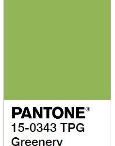
 Pantone® – THE authority on color for the fashion and design industries – has found the ideal cure for Spring fever with its 2017 Color of the Year. Dubbed “Greenery” (Pantone 15-0343) is literally a breath of fresh air. Whether bringing a new look to a living space by incorporating an accent wall, evoking a feel of welcome by painting your front door or adding pops of color throughout your interior with accent pieces and décor, Greenery is “a refreshing and revitalizing shade… symbolic of new beginnings.”
According to Leatrice Eiseman, Executive Director of the Pantone Color Institute, “Greenery bursts forth in 2017 to provide us with the reassurance we yearn for amid a tumultuous social and political environment. Satisfying our growing desire to rejuvenate and revitalize, Greenery symbolizes the reconnection we seek with nature, one another and a larger purpose.”
This yellow-green hue plays well with others. Pantone suggests palettes that include everything from a tropical bright such as Calypso Coral (Pantone 17-1744), to a cool neutral like Bronze Mist (Pantone 17-0843), to a sweet pastel such as Spa Blue (Pantone 12-4306) and virtually everything in between.
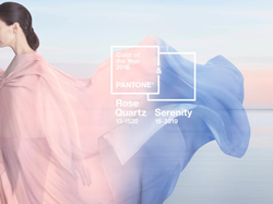
Past Colors of the Year from Pantone have included Rose Quartz (Pantone 13-1520), Serenity Blue (Pantone 15-3919), Marsala (Pantone 18-1438), Radiant Orchid (Pantone 18-3224), Emerald (Pantone 17-5641), Tangerine Tango (Pantone 17-1463) and Honeysuckle (Pantone 18-2120) – among others.
Through our custom home construction and luxury renovation divisions, Highlight Homes regularly assists clients in the selection of colors – in addition to eco-friendly construction materials, design elements, interior and exterior finishes, and more. If you’d like to learn more about all of our service offerings and see some of our work, we invite you to visit us at www.highlighthomesga.com. To schedule a free consultation for a reimagining of your current home or to discuss your vision for your custom dream home, contact the Highlight Homes team at 678,873.9234 or info@highlighthomesga.com.
About Pantone and the Pantone Color Institute
Pantone LLC, a wholly owned subsidiary of X-Rite, Incorporated, is the global color authority and provider of professional color standards for the design industries. Pantone products have encouraged colorful exploration and expressions of creativity from inspiration to implementation for more than 50 years. Through the Pantone Color Institute, Pantone continues to chart future color direction and study how color influences human thought processes, emotions and physical reactions. Pantone furthers its commitment to providing professionals with a greater understanding of color and to help them utilize color more effectively. Always a source for color inspiration, Pantone also offers designer-inspired products and services for consumers. More information is available at www.pantone.com/plus.
