19 Design and Construction Trends for 2019

It’s a new year full of new possibilities! As one of Atlanta’s premier custom homebuilders and renovation firms, Highlight Homes places an emphasis on staying on top of the latest design and construction trends – and occasionally setting a few trends of our own! With 2019 now underway, we take pride in “highlighting” the top 19 Design and Construction Trends for the new year…
- Green Construction – As a company that places a HUGE focus on environmental-friendliness (and always has), we’re particularly happy about this trend. From smart homes to a focus on energy efficiency in appliances, windows, doors and more, we don’t see this trend going anywhere but UP!
- Waste Reduction – Going hand-in-hand with Highlight Homes’ focus on Green Construction, we – and now many of our friends within the industry – are placing a greater emphasis on waste reduction by streamlining processes and recycling. It’s good for everyone involved – the builder, the client AND the planet.
- Project Management Solutions – Highlight Homes is pleased to partner with Co-Construct, a secure, easy-to-use online service that allows our clients to make selection decisions, approve change orders, reply to messages, check progress information, review project files, and more. Communication is key to a smooth project!
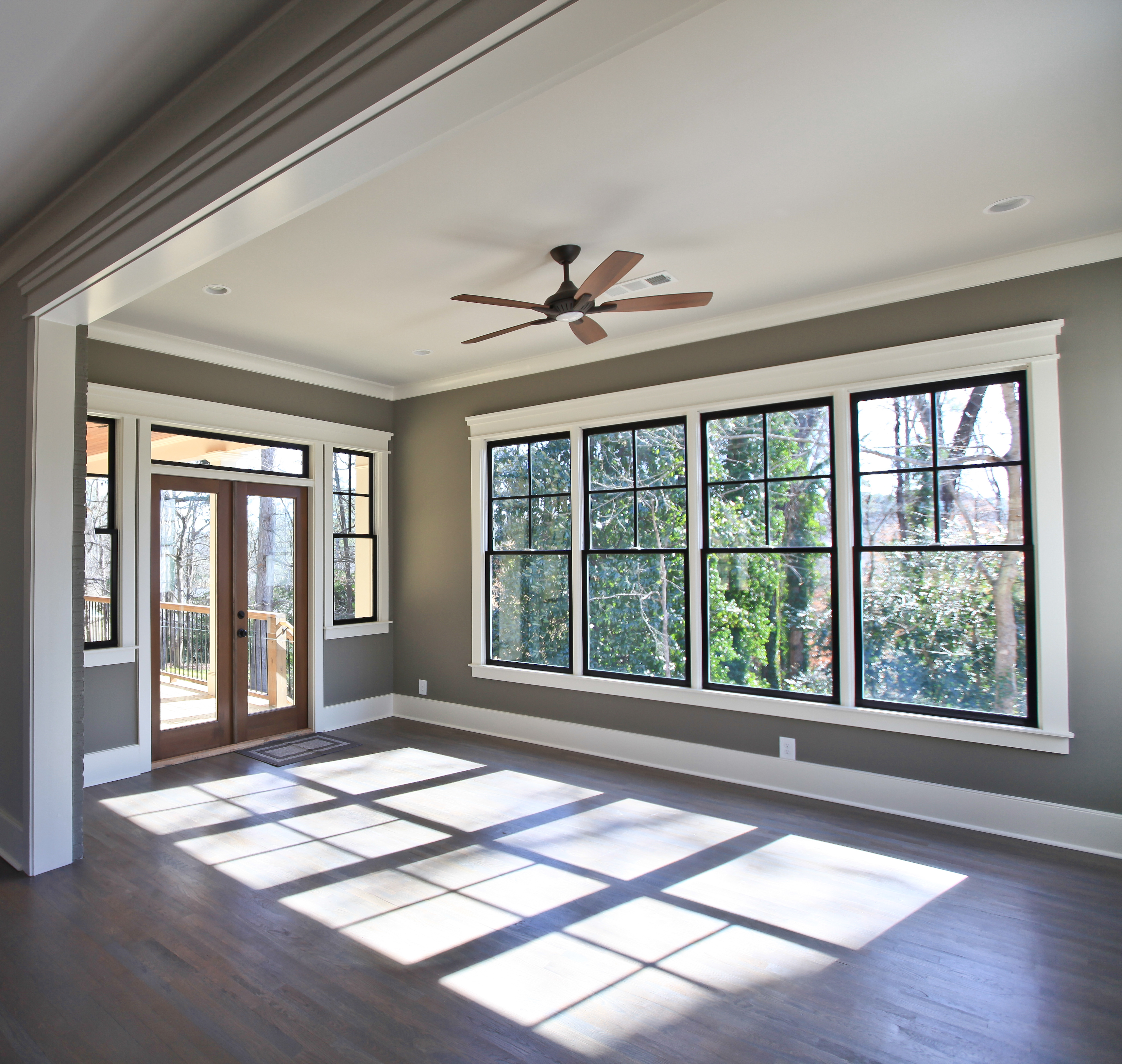
 Sunrooms and Outdoor Living Spaces – Homebuyers and home owners are showing an ever-increasing desire to infuse a connectivity with the outdoors in their homes through exterior living spaces and the addition of sunrooms.
- Open Kitchens – Creating a sense of “dinner theatre,” more and more kitchens are opening up to the family room. Not only does it emphasize the home’s spaciousness and seamless flow of the floor plan, but it also encourages interactions between the inhabitants of those two often occupied living spaces.
- Home Office – With the growing popularity of remote workers/telecommuters, the concept of a home office or study is seeing a resurgence. Just imagine closing the office for the day and only commuting a few steps before spending the rest of the evening with your family as opposed to an hour or more on the interstate each day.
- “Pop the Top” Renovations – This is one of our personal favorites, when a ranch home is converted to a two-story by simply removing the existing roof and creating an entirely new level – virtually transforming the look and layout of the home to fit the needs of the family who lives there (or will live there).
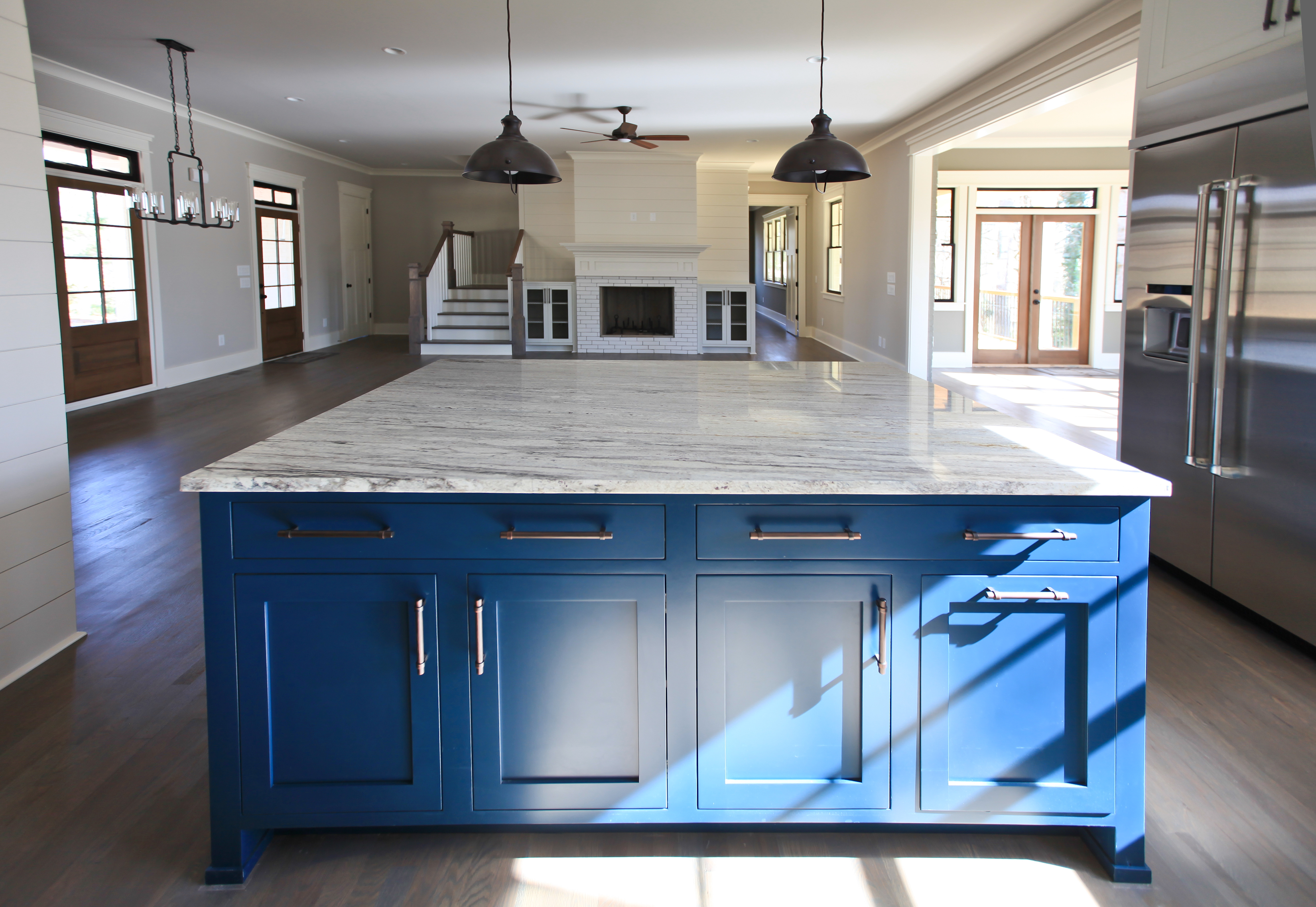
 Two-Tone Cabinets in the Kitchen – Designers are becoming increasingly more daring in their color schemes – often selecting a different color for the island than what is featured on the walls. There is also a trend towards using one color ABOVE and another color BELOW the counter.
- Multi-Purpose Kitchen Islands – From storage and seating to meal prep and service, there are a number of very good functions for this mainstay of the modern kitchen. Don’t merely settle for a permanent fixture with a countertop – consider all of the great ways you could use that space. Love wine? Consider adding a wine cooler underneath next to a wine rack. Enjoy catching up on the day’s events while preparing a meal? Extend the countertop out so there’s plenty of space for seating underneath so family members and guests can pull up a stool while you work your magic.
- Focus on Minimalism – Clean lines rule the day in 2019, along with uncluttered spaces and smart use of space. Get rid of what you don’t need or stow it away out of sight for a simple yet sophisticated look.
- Accessories that Make a Statement – However, when you DO add an accessory or two to a space, make it count. It should be eye-catching – like an accent colored end table or a bold piece of artwork.
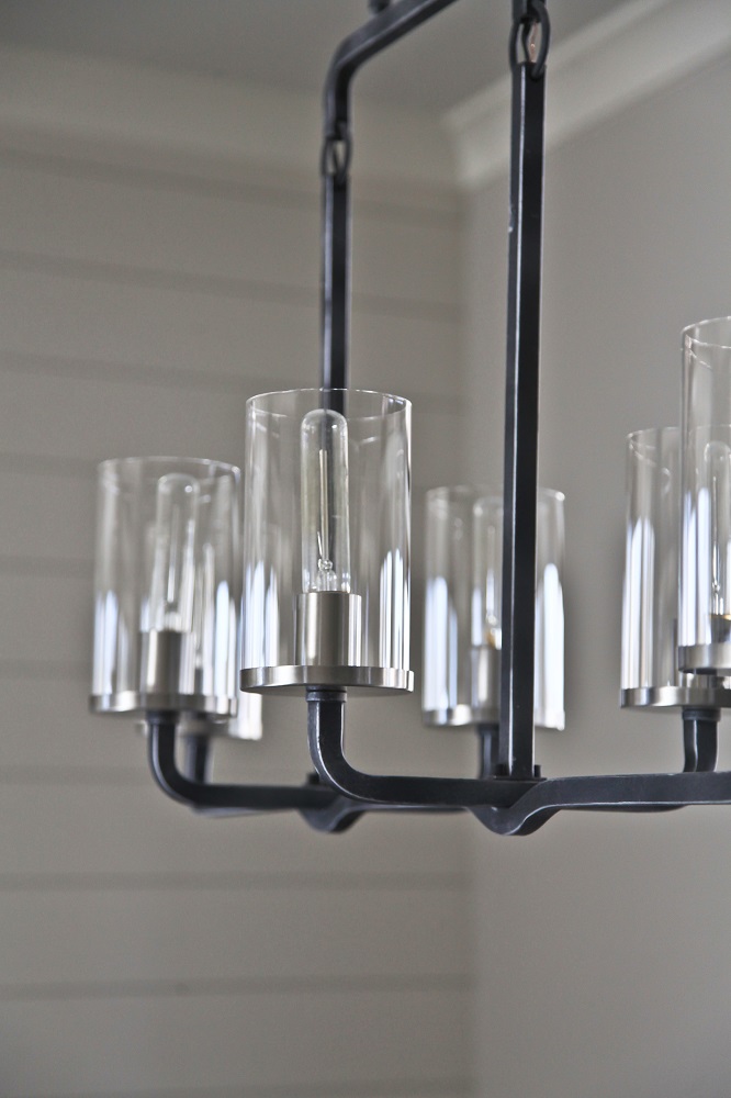
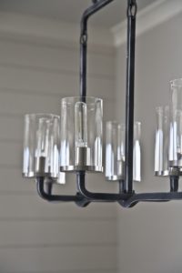 Eye-catching Lighting – More than merely serving a purpose, your light fixtures are another way to really make a statement and draw the eye. Great lighting that adds to the appeal of a room is a smart investment.
- Open Shelving in the Bathroom and Kitchen – With a movement towards minimalism, there’s a growing trend towards open shelving among the cabinets found in bathrooms and kitchens. Be careful to keep these shelves uncluttered for a more appealing appearance.
- Eclectic Blends – More and more designers are enjoying a “no rules” leaning towards the concept of interior design. We’re seeing a lot of eclectic blending of styles including BoHo, Modern, Industrial, Farmhouse Chic, Traditional, Rustic, European-influences and more.
- Mixed Metals – Just as décor is seeing a blend of different styles, there is also a growing trend towards the mixing of different metals. Rather than merely seeing nickel door knobs, drawer pulls and faucets throughout the home, we’re starting to see a blend of gold, copper, bronze, silver, brass and industrial-inspired metals like matte black steel and more burnished metals.
- Tasteful Textures – In order to keep a minimalistic look from being boring, many designers are adding texture in upholstery, rugs, accents and even walls.
- It’s All in Black and White – Shades of white on walls and trim juxtaposed against bold black kitchen cabinets are witnessing a rising popularity. Not only do these two colors work well together, they also invite POPS of color in artwork, accessories and accent pieces. Jewel tones are increasingly popular and work beautifully against both black and white.
- Comfort Cavalcade – It’s all too easy for a minimalistic look to seem uninviting. That’s why there’s an emphasis on including comfy, cozy and inviting furniture for your living spaces. It’s entirely possible to provide seating that looks refined but also communicates “relaxation.” Don’t merely purchase furniture for its visual appeal, give it a test run and try to imagine spending long binge-watching sessions there.
- Pantone Color of the Year: Living Coral – Pantone – THE authority on color for the fashion and décor industries – has announced its color of the year for 2019. Drum roll, please…. It’s Living Coral (Pantone 16-1546). The company describes it as “An animating and life-affirming coral hue with a golden undertone that energizes and enlivens with a softer edge.” It’s a great addition as an accent color in accessories for the home and plays beautifully against white walls, as well as greys, greens, blues and other warm pastels.
Highlight Homes welcomes the opportunity to help you incorporate one or more of the trends listed above in your next renovation project or custom home. We invite the opportunity to start a discussion with you and can be reached at 678-873-9234, info@highlighthomesga.com or via our convenient online contact form. To learn more about us and take a peek inside past Highlight Homes’ projects, please visit us at www.highlighthomesga.com. HAPPY NEW YEAR!


 of the Year: Rose Quartz and Serenity")