The Change of Seasons is a Great Time to Stir up a Little Change of Your Own at Home with the Hottest New Fall Colors

While the mercury in our temperature gauges may not have received word yet that Fall is on the way, believe it or not – Summer officially gives way to Autumn on Friday, September 23. Take a spin through your favorite mega store, and don’t be surprised to see Halloween candy lining the shelves and Halloween costumes hanging from the racks. Before we know it, it will be time to pull those sweaters out of storage and FINALLY turn off the air conditioning. Within the next month, the leaves will begin changing in the trees, perhaps inspiring a little change at home, as well. Fall is a terrific time to look to Mother Nature and the fashion industry for inspiration, and Highlight Homes is a terrific resource to help you implement that change.
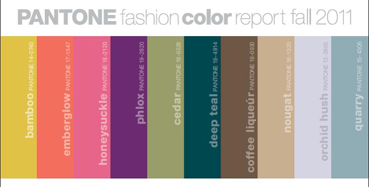
One of the easiest and most cost-effective changes you can make to your home’s interior or exterior is your paint color. Taking a cue from New York Fashion Week earlier this year when some of the nation’s brightest designers unveiled their hottest fashion trends for Fall 2011, Pantone – THE authority in color – released its Fashion Color Report. Since fashion trends often bleed over into interior design, we thought you might like to use some of their suggestions as the source for a possible decoration revelation. Titled “The Art of Color – Sensible and Spirited”, the Pantone Fashion Color Report for Fall 2011 suggests a standout yellow with green undertones in its Bamboo (Pantone 14-0740), a radiant fiery orange in its Emberglow (Pantone 17-1547), the color of the year – a playful reddish pink called Honeysuckle (Pantone 18-2120), a deep rich purple in its Phlox (Pantone 19-2820), a soft soothing green in its Cedar (Pantone 16-0526), and an oceanic blue-green in its Deep Teal (Pantone 19-4914) paired with striking neutrals such as Coffee Liquer (Pantone 18-0930) or Nougat (Pantone 16-1320) or grays like Orchid Hush (Pantone 13-3805) or Quarry (Pantone 15-4305). For more of a masculine feel, the warm orange glow of Burnt Sienna (Pantone 17-1544), the luxuriant pink hue of Raspberry Wine (Pantone 18-1741), or the delicate co-mingling of blue and gray in Cadet (Pantone 18-3812) will surely fit the bill. Any of these colors can be used as decorative accents in throw pillows, décor, accent walls, or entire rooms for a striking fall statement that will continue to please year-round.
Whether you choose to limit yourself to just a touch of Fall color here and there with a weekend do-it-yourself painting party or have exciting bigger changes in mind and wish to leave the work to the professionals at Highlight Homes, we hope this blog has helped motivate you to put a little Fall on your wall. To schedule a color consultation, the talented team of professionals at Highlight Homes can be reached at 678-873-9234, via e-mail at info@highlighthomesga.com, or via our convenient online contact form. We look forward to your call!
Happy (almost) Fall, y’all!
Pantone Fashion Color Report: Fall 2011. Fall 2011 – The Art of Color – Sensible and Spirited. http://www.pantone.com/pages/pantone/pantone.aspx?pg=20835&ca=4 (September 13, 2011)