Top Paint Experts Weigh in on This Year’s Hottest Color Trends
 According to reports late last year from Pantone, the global authority on color and provider of professional color standards for the design industries, THE hottest color for 2010 is turquoise. Believed by many cultures to be a talisman color – inspired by the sea and sky, it’s a shade associated with deep compassion, healing, faith and truth. Not only is it a soothing color to add to one to all four walls of a room, it’s a terrific shade to add as a SPLASH of color through throw pillows, lamps and other décor accessories. Pantone leads the way for builders, painters, interior designers, and fashion designers all over the world. And – while most paint companies have taken cues from Pantone regarding color trends for 45 years, some are setting a few trends of their own.
Benjamin Moore’s hottest color for 2010 is Cedar Green (2034-40)– a “vibe filled green that offers flexibility in design. “ It’s a cool color that blends well with navy blues, buttery yellows and cottony whites. Not only is Green all the rage in relation to environmental concerns – it is also from a color family that promotes relaxation and balance because it is in the middle of the visible spectrum of light. For more information about Benjamin Moore Paints and their latest color palettes, visit them online atwww.benjaminmoore.com. Check out their new Personal Color Viewer, where you can upload pictures of your home’s interior and exterior – and use a virtual paint brush to try out colors from Benjamin Moore’s collections before you ever lay down a dropcloth.
Sherwin Williams developed their 2010 Color Forecast by looking to “hues of the past to paint their way into the future” with their inspired Rooted, Treasured, Simplified and Refreshed Collections – many with cool shades of blue and green, bold reds, corals and golds, and tried-n-true neutrals. To view Sherwin Williams newest color collections online, visitwww.sherwinwilliams.com. They also feature an online color visualizer, as well as earth-friendly paints with their “Greensure” designation – offering maximum performance, long-term durability and the highest indoor air quality ratings.
Duron Paints & Wallcoverings – the “Pros Choice” since 1949 – also looks to the past (the Old South, to be exact) for the latest color trends with its Historic Collection Palettes, including The Carolina Lowcountry Collection and Colors of Historic Charleston. Blues and greens again play a vital role in these palettes, with a supporting cast of warm corals and shades of neutral. For more information and to view the company’s latest color palettes, visit www.duron.com.
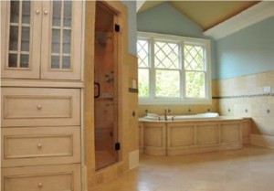
Behr suggests you use color to create an ambience and set a mood in any room. Cool colors can impart a calm, serene effect while warm colors can invigorate and energize. Soft shades of green and blue are perfect for a room intended for peace and relaxation – such as bedrooms and bathrooms, while bold shades of yellow or orange can be uplifting and lively – perfect for kitchens or family rooms. Neutrals, such as a harmonious and peaceful taupe, can add a sense of sophistication and style to any home. For more information or to visualize your colors virtually with ColorSmart, visitwww.behr.com.

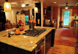
Modifying your paint color is perhaps one of the easiest and least expensive ways to change up the look of the interior and exterior of your home. When undergoing a home renovation, it’s an element that should receive much attention – as color can often help to pull all of the pieces of the puzzle together beautifully. Highlight Home Restoration designates Sherwin William’s Copper Wire (7707) as OUR number one pick for color this year. It’s reminiscent of last year’s warm terracotta orange called Clay Pot, which we used with great success in a kitchen remodel. Orange is a color that adds life and vibrancy to a room, lifts the spirits of the all who enter and blends well with natural elements like household plants, hardwood floors, granite countertops, and wood cabinetry. To begin selecting your color palette and get started on your Atlanta home renovation for 2010, call Highlight Home Restoration’s talented team of experts at 678.873.9234, e-mail us atinfo@highlighthomesga.com, or fill out our online contact form.
Sources:
Color of the Year 2010 – Living in Color with Sonu –http://livingincolorwithsonu.typepad.com/sonu_blog/2010/02/color-of-the-year-2010.html
2010 Color Forecast http://www.sherwin-williams.com/pro/paint_colors/paint_color_trends/2010/
Duron’s Color System http://www.duron.com/do-it-yourselfers/color/color_palettes.asp
Pantone Unveils Color of the Year for 2010: PANTONE 15-5519 Turquoisehttp://www.pantone.com/pages/pantone/pantone.aspx?pg=20706&ca=10
Palettes that Please http://www.behr.com/dsm-ext/v/index.jsp?vgnextoid=6bf7a8c16b286110VgnVCM1000006b0910acRCRD&vgnextf